Brand-led web design / WordPress
Visit the live website ↗Karmanify.
A welcoming digital presence for Iris Kanja’s life coaching and active listening business. Thoughtful design for a personal next chapter.
Explore the project
- Created for
- Iris Esprit Kanja
Karmanify - My role
- Website design
Digital brand application - The experience
- Visual direction · Content layout
Services · Resources · Contact pathways - Platform
- WordPress
Published website
01 / The brief
A clear path.
A warmer welcome.
Karmanify introduces two personal services: coaching for people ready to work toward change, and active listening for people who need space to be heard. My task was to design a website that presents that choice clearly and makes it easy to learn about Iris and take the next step.
The audience
People considering personal support need an experience that feels calm, approachable and easy to understand. The design gives service information a clear hierarchy and leaves room for the person behind the business.
The design response
A warm photographic introduction, a consistent burgundy and lavender visual language, distinct content sections and visible calls to action. The website connects the business story to practical routes into services, resources and contact.
02 / Bringing the identity into the website
A personal business.
A consistent presence.
The published identity uses a burgundy K monogram and a botanical detail. In the website, burgundy continues through navigation, headings, icons and calls to action, while soft surfaces and landscape imagery keep the tone welcoming.
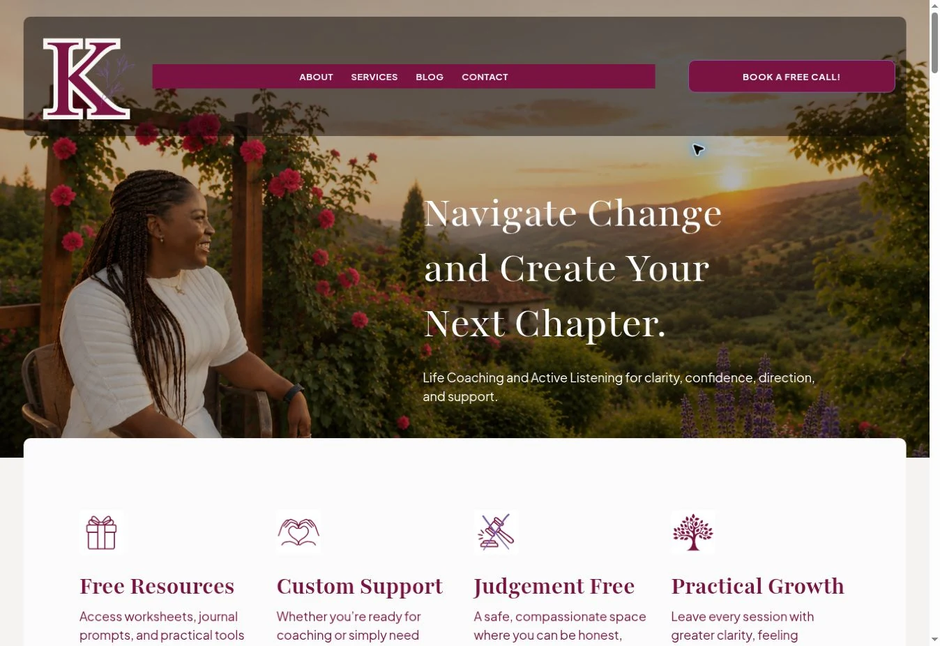
Actual published homepage, captured for this case study. The identity is shown in the context of my website design.
03 / Color & typography on the live site
Depth in the accents.
Light in the layout.
The website uses burgundy as a consistent anchor, lavender for supporting emphasis, and warm off-white surfaces for content. The palette connects the monogram, interface and editorial sections.
#7A1342RGB 122 · 19 · 66Headings / primary actions
#7D5BA6RGB 125 · 91 · 166Supporting accent
#F5F2F2RGB 245 · 242 · 242Page background
#FBFBFBRGB 251 · 251 · 251Content / interface contrast
Live headline family
Playfair
The serif headline family gives the first impression an editorial character. Large headings establish the page’s rhythm before smaller content sections take over.
Observed on the published website: Playfair, with a serif fallback.
Live body & interface family
Plus Jakarta
A sans serif family supports navigation, descriptions and buttons. It provides a clear distinction between expressive headings and practical information.
Observed on the published website: Plus Jakarta, with a sans-serif fallback. The live pairing is visible in the website capture above.
04 / Information architecture & visitor journey
Make the next step
easy to find.
The content moves from a personal introduction to service information and ways to begin. Visitors can explore the business before deciding whether to make contact, look into a discovery call or start with a resource.
Understand
A clear introduction establishes the focus of the business and the support offered.
Connect
Iris’s story and supporting information introduce the person behind the service.
Explore
Service pages, articles and resources give visitors several routes to learn more.
Take a step
Contact and discovery-call links provide a visible next action.
05 / WordPress website design
One place for
the whole business.
I designed the Karmanify website in WordPress, organizing the service information, personal introduction, supporting content and contact routes into one consistent digital experience.
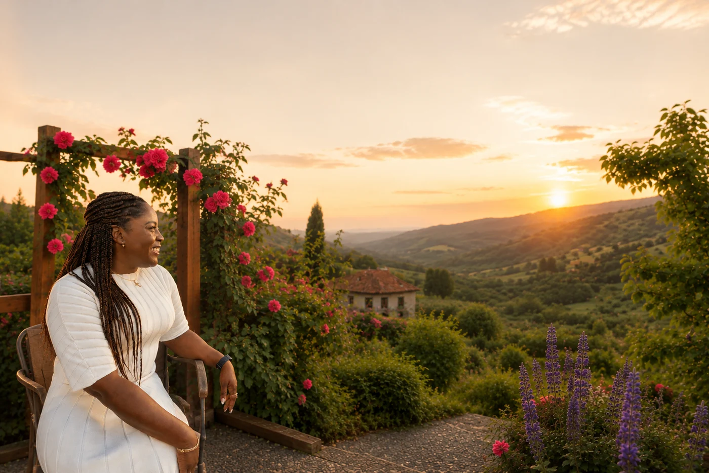
A recognizable welcome
Brand color, the monogram and a strong photographic introduction work together in the first screen.
Structured content
The page separates the main message, service benefits, the business story and supporting resources.
Clear contact routes
Repeated calls to action make it possible to continue after different stages of the story.
06 / Project delivery
Design that connects
the details.
The project brings Karmanify’s visual presence and service information into a published website. This case study documents my website design and the way the brand is applied across the experience.
- 01
- Website designA complete digital presence for Karmanify’s coaching and active listening services.
- 02
- Visual consistencyColor, typography, imagery and interface treatments applied across page sections.
- 03
- Content layoutA clear hierarchy for the business introduction, services and supporting information.
- 04
- WordPress implementationThe published website with navigation, service information and contact pathways.
More from the same designer