PDF / 2 PAGES
Label & specification
The Orange front label with bleed, plus the design specification covering logo use, typography, colors and proposed dimensions.
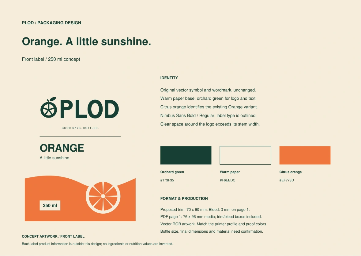
Preview both pages
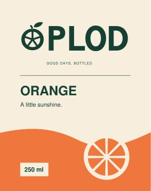

A little sunshine.
A shared everyday ritual.
SECTOR
Juice & everyday drinks
SCOPE
Complete concept identity
FORMAT
Packaging · Web · Social · Film
Create a welcoming juice brand that feels like part of a family table: easy to recognize, warm to hold and consistent wherever it appears.
Adults and families who enjoy simple shared rituals. The identity needs the warmth of a local producer and the clarity of a contemporary shelf presence.
“Plod” means fruit or yield in Serbian. The short name connects the product to its source, while the rounded citrus fruit-and-leaf symbol turns growth into a friendly signature.
Warm. Direct. Optimistic. Short sentences and everyday language. Serbian slogan: “Dobar dan počinje plodom.” English campaign line: “Good days, bottled.”
Self-initiated concept developed for this portfolio with AI assistance. PLOD is an illustrative brand, not a commissioned client project. Product formulations, certifications and commercial results are not claimed.
Citrus cross-sections suggest circular framing; a deep green anchors the mark; warm paper tones soften digital layouts. The direction favors generous spacing, rounded forms and a familiar table-side feeling.
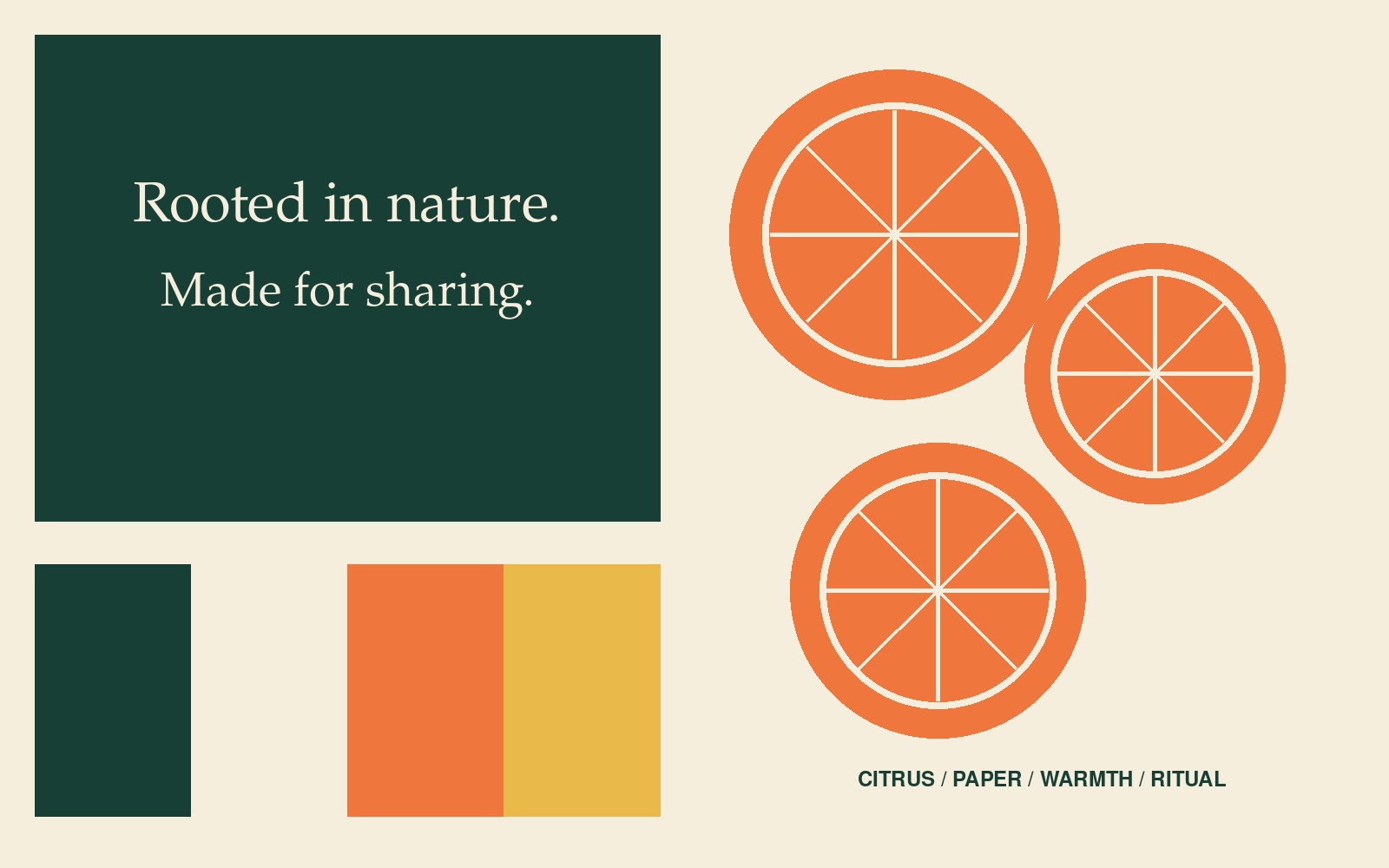
An original graphic direction board: color, form, material cues and tone, rather than stock lifestyle photography.
The vector wordmark uses bold, open forms for visibility on a small label. A sliced citrus fruit with a leaf makes the meaning of Plod immediately visible. The complete mark reverses as a single unit, including its lettering and campaign line.
Primary / light background
Download light-background SVG ↓

Reverse / dark background
Download dark-background SVG ↓
Keep clear space of at least the stem width of the P on all sides. Recommended minimum full-lockup width: 180 px digitally. For smaller applications, omit the slogan. Do not stretch, add shadows or place the mark over busy imagery.
#173F35
Primary text / logo
#F6EEDC
Main canvas / reverse type
#EF773D
Campaign / flavor accent
#E9B949
Secondary flavor accent
Use cream for breathing room, green for reading and orange for moments of emphasis. Small text stays green on cream or cream on green; accent colors support the composition.
Nimbus Sans Bold / headlines
Good daysABCDEFGHIJKLMNOPQRSTUVWXYZ
abcdefghijklmnopqrstuvwxyz
0123456789
Georgia Regular / editorial accent
Nimbus Sans Regular / body copy
Bring a little brightness to the table. Pour, pause and enjoy the moment together.
Nimbus Sans is bundled with the portfolio; Georgia uses the visitor’s installed system font with a serif fallback. The logo is custom vector lettering, separate from the text fonts. Headlines: bold and compact. Body copy: regular, with generous line spacing.
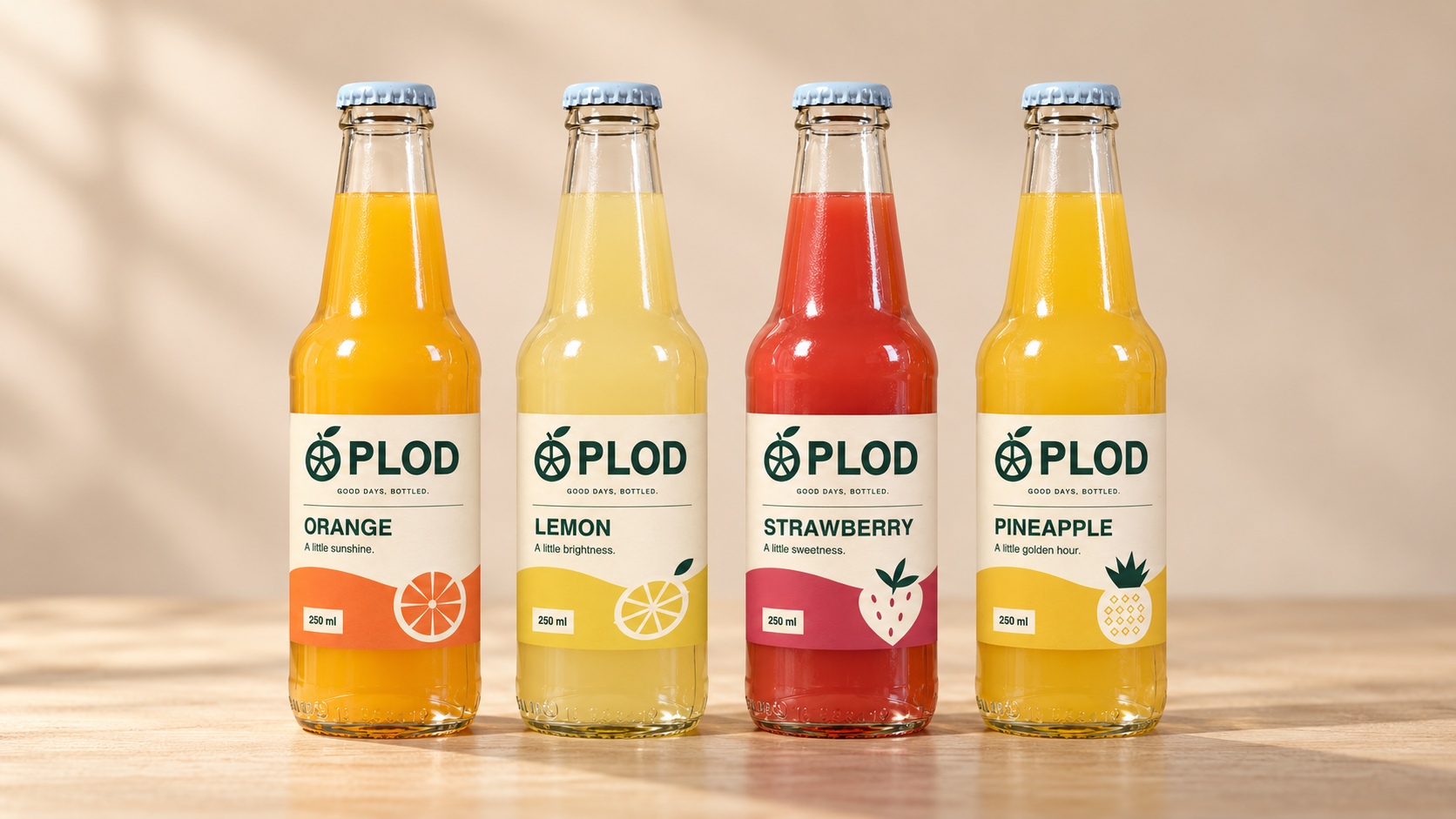
The cream label creates a stable reading area. Brand first, flavor second, supporting line last. Orange, lemon yellow, strawberry red and pineapple gold identify the four flavors. Each label carries its own small fruit illustration while the master logo stays the same.
Illustrative packaging mockup. A production label would additionally need verified ingredients, nutrition, allergens where applicable, storage instructions, producer details and barcode. This artwork is a design presentation.
LABEL ARTWORK / VIEW & DOWNLOAD
Explore the front-label design and its packaging specification. Preview the pages here, open the PDFs in a new tab or download a copy.
PDF / 2 PAGES
The Orange front label with bleed, plus the design specification covering logo use, typography, colors and proposed dimensions.
PDF / 1 PAGE
The label artwork on its own: revised PLOD citrus mark, Nimbus Sans typography and the Orange variant in the established brand colors.
Proposed front label: 70 × 90 mm, with 3 mm bleed. The artwork is a portfolio concept; final bottle dimensions, production material and printer color profile need to be confirmed.
Orange, lemon, strawberry and pineapple: each fruit has its own color and small illustration. The citrus-and-leaf PLOD logo, cream reading field and type hierarchy stay consistent.
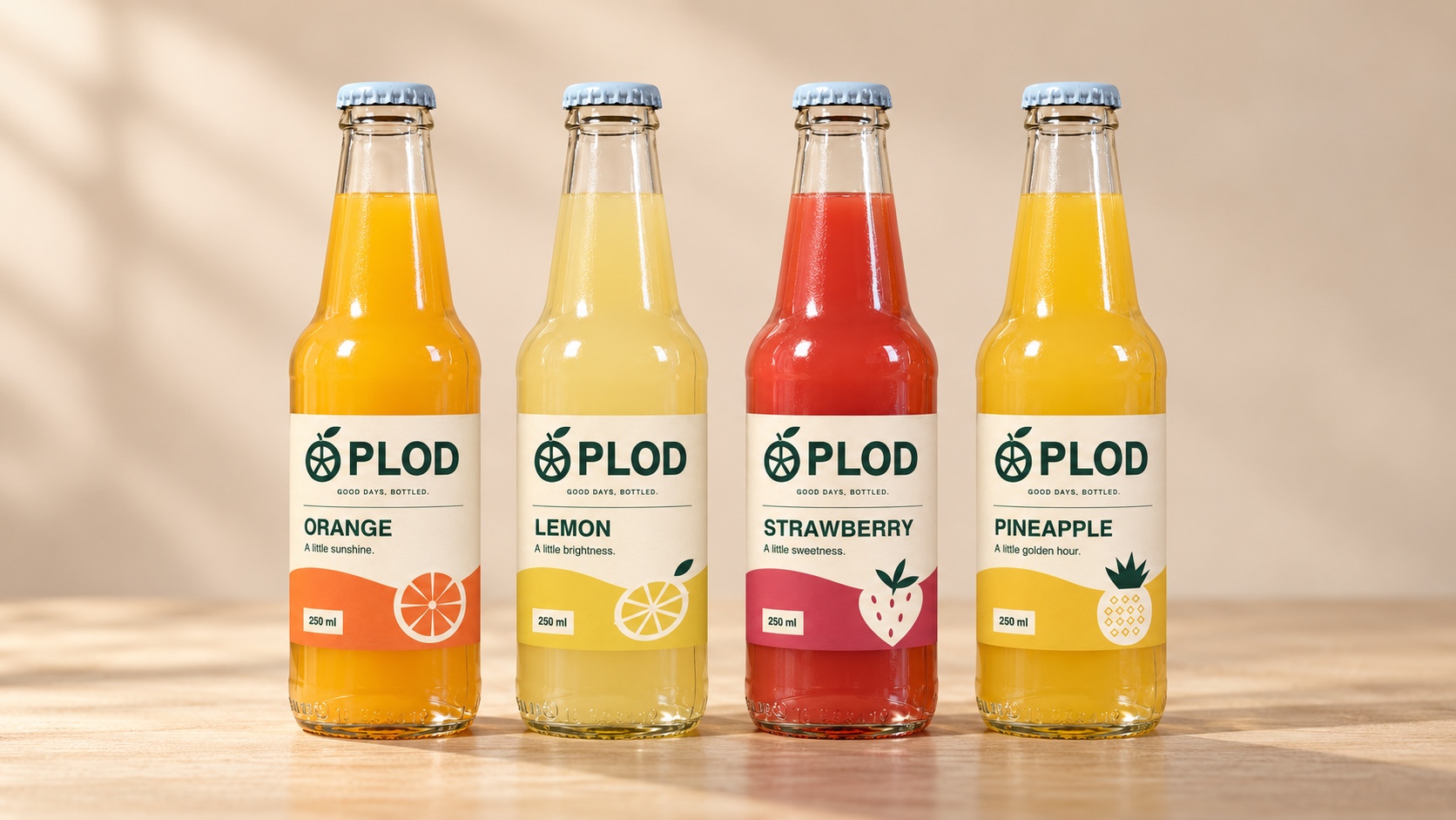
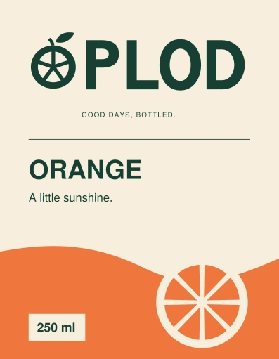
Flavor accent #EF773D
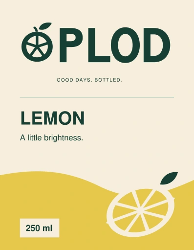
Flavor accent #E5C84B
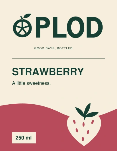
Flavor accent #B84A5B
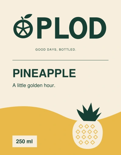
Flavor accent #E9B949
Concept front labels: 70 × 90 mm with 3 mm bleed. Each flavor uses the same master structure. Formulations and final regulatory information require confirmation before production.
PLOD / DIGITAL CAMPAIGN MOCKUP
A bright little moment for the table.
Meet PLOD ↗Website hero layout concept
PLOD / SOCIAL CAMPAIGN
Good days.Pour a little sunshine.
#GoodDaysBottled
On the web, a clear headline leads to one action. On social, the same type, colors and optimistic voice create instant recognition. These are design applications within the case study.
Morning light, shared breakfasts and afternoons with friends, connected through PLOD's visual identity. The two edits combine the revised citrus logo, consistent Nimbus Sans typography, an English voiceover and music, The horizontal film uses its wide composition; the vertical film fills the full 9:16 screen with footage and overlaid text.
1920 × 1080 · 30.7 seconds · Voiceover & music
Download horizontal MP4 ↓1080 × 1920 · 30.7 seconds · Voiceover & music
Download vertical MP4 ↓Concept campaign · Supplied lifestyle and bottle footage · Revised PLOD citrus identity, separately composed for both screens
The name establishes the source. The logo makes it recognizable. The palette carries the mood. Type organizes the message. Packaging gives the identity a physical form, and motion extends the same language across screens.
This concept demonstrates a complete visual system and its applications. No sales uplift, user testing or client approval is implied.
Back to branding work ↗A practical, 24-page guide to the complete PLOD identity: logo use, color and patterns, typography, internal and external documents, email design, marketing, packaging and motion.
Page 1 of 24 / The identity system

Select a page to browse the guide. Open the page image to enlarge it, or open the PDF to read the complete document.


