Brand identity & digital experience / 2026
Visit the live website ↗Balkan Roots
Living.
One family. Two cultures. A complete brand and digital home, created for Iris Kanja.
Explore the whole story
- Created for
- Iris Kanja
Balkan Roots Living · Kanja LLC - Design by
- Bojan Kanja
Brand identity & website - The package
- Logo development · Color · Typography
Art direction · Graphic language · Web design - Experience
- English / Serbian
Mobile / Desktop
01 / The story & the brief
A personal story.
A place to belong.
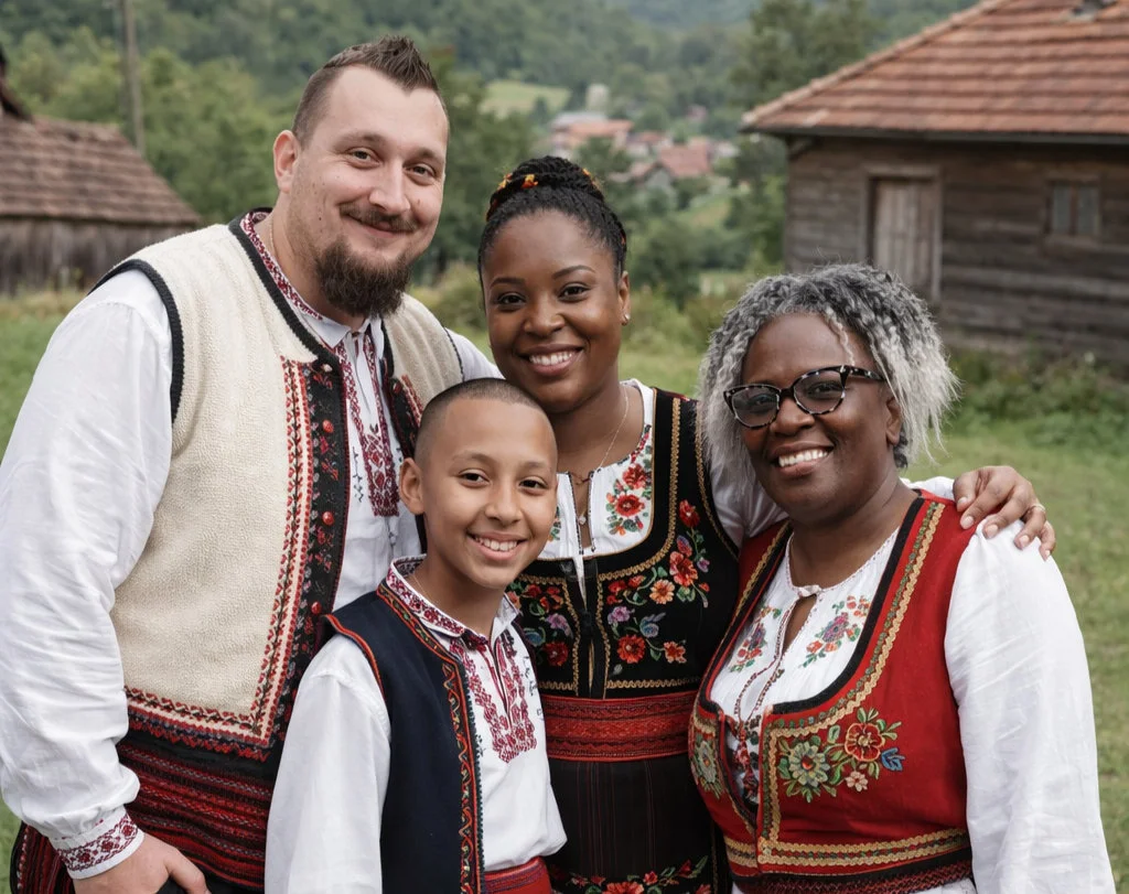
Iris shares the everyday life of an American woman and her family in rural Serbia. The brief was to turn that story into a recognizable brand: personal enough to feel like Iris, rooted enough to feel Serbian, and clear enough to work across a modern website and social channels.
The design challenge
Bring a detailed illustrated identity, traditional embroidery and a growing collection of stories into one coherent system. The website needed room for videos, press coverage and collaborations, while keeping the family at the center.
The creative direction
Modern Serbian etno: warm paper, earthy color, expressive editorial type and carefully placed folk decoration. The balance is deliberate—heritage provides the character; spacing and hierarchy keep the experience contemporary.
02 / Logo creation & development
A portrait.
A place.
A point of connection.
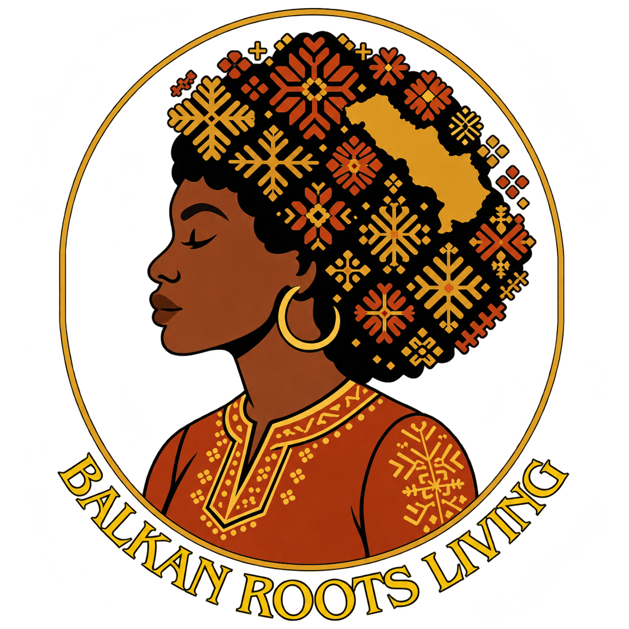
The emblem brings Iris’s identity and her Serbian home into the same image. A profile portrait, folk dress, floral embroidery and a circular border build a recognizable signature. The shape of Serbia sits within the hair, making the connection to place part of the portrait itself.
Start with the person
The portrait keeps the brand attached to Iris and her story. The warm skin tones and calm expression set a welcoming tone.
Connect two cultures
Serbian folk dress and embroidered motifs meet the portrait. The Serbia silhouette is integrated into the hair as a focal detail.
Give the story a signature
The circular frame holds the illustration and name together. Rust and gold link the emblem to the wider digital palette.
Make it usable
The transparent background lets the emblem sit naturally on warm surfaces. On the website, a separate text lockup keeps the name readable beside the smaller logo.
03 / Color palette
Earth, warmth
and a little gold.
The digital palette takes its lead from the illustrated logo. Dark brown provides a strong reading color, cream makes room for the story, and terracotta and gold bring the warmth of the emblem into headings, details and calls to action.
#44301CRGB 68 · 48 · 28Primary text / dark sections
#FBF6E9RGB 251 · 246 · 233Main canvas / light type
#A95827RGB 169 · 88 · 39Editorial emphasis / links
#E5AF61RGB 229 · 175 · 97Highlights on dark fields
#8E3831RGB 142 · 56 · 49Supporting UI accent
Supporting surface: Paper / #F3EBDA. Use brown on cream for sustained reading, cream on brown for the dark hero, and gold as an accent on dark backgrounds. The supplied embroidery keeps the colors of its original artwork.
04 / Typography & voice
An editorial voice.
A human rhythm.
Georgia gives the website its expressive serif headlines and italic accents. Trebuchet MS brings a friendly, practical rhythm to body text, navigation and controls. The illustrated lettering stays inside the logo; the website uses a separate, readable type hierarchy.
Georgia / Regular & italic
with roots.
Aa Bb Cc Čč Ćć Đđ Šš Žž
0123456789
Headlines, story introductions and editorial details. Tight headline spacing; more room around paragraphs.
Trebuchet MS / Regular & bold
A clear next step.
Our stories bring together village life, family, culture and the everyday moments that make a place feel like home.
ABCDEFGHIJKLMNOPQRSTUVWXYZ
abcdefghijklmnopqrstuvwxyz
Č Ć Đ Š Ž / č ć đ š ž / 0123456789
Body copy, menus, labels and buttons. Georgia and Trebuchet MS use system font stacks with serif and Arial fallbacks.
A life rooted in Serbia.
Warm, personal and conversational. Short introductions lead into the family’s story.
Život ukorenjen u Srbiji.
Topao, ličan i neposredan ton. Ista priča, prilagođena publici na oba jezika.
05 / Serbian folk pattern & graphic language
Heritage,
with room to breathe.
The supplied Serbian embroidery pattern becomes the website’s visual thread. It frames the page edges and separates sections on desktop and mobile. Using it in narrow bands preserves its character while leaving the photography and text enough space.
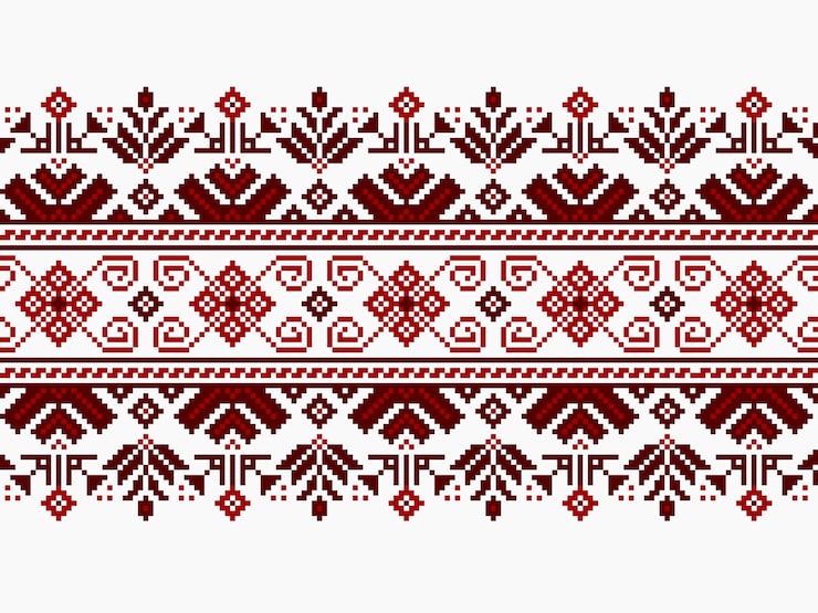
Original pattern supplied for this project. Pattern selection, placement and digital application form part of the brand system.
Section divider / a restrained horizontal repeat
The placement principle
Frame. Separate. Connect.
Keep decorative motifs at the edges of content. Reduce their scale on mobile, repeat them consistently and keep busy textures away from small text.
06 / Photography & art direction
Real people.
A lived-in world.
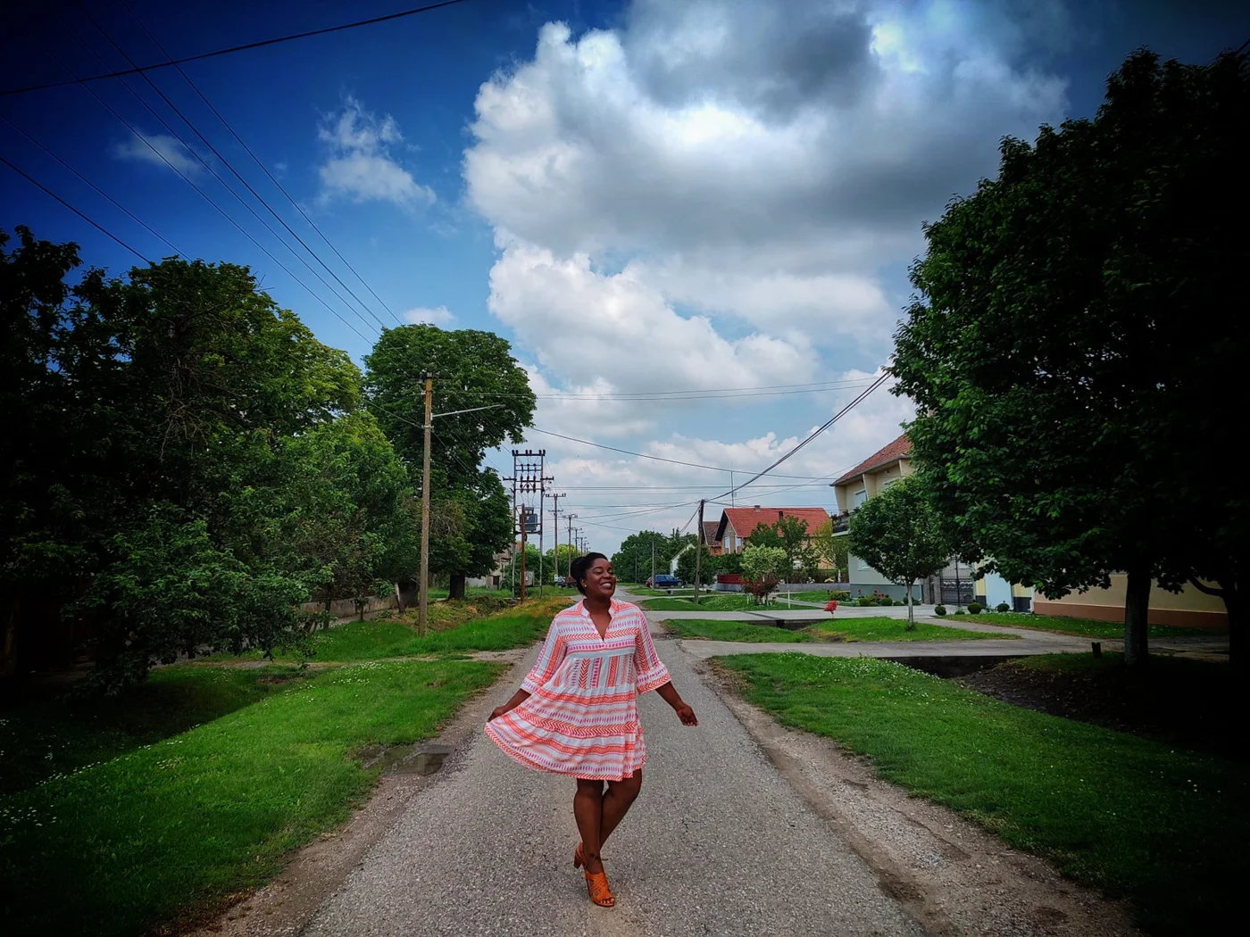
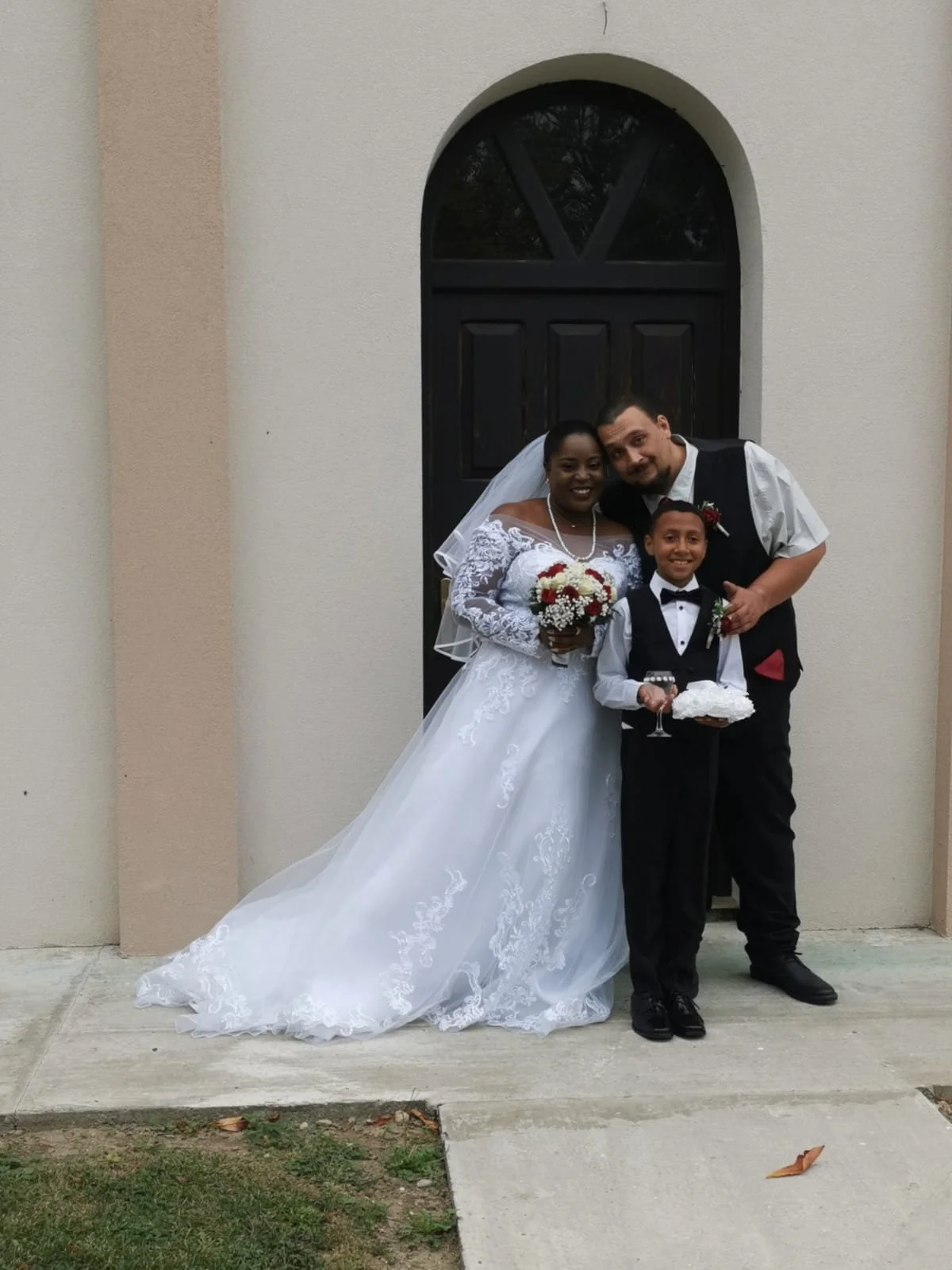
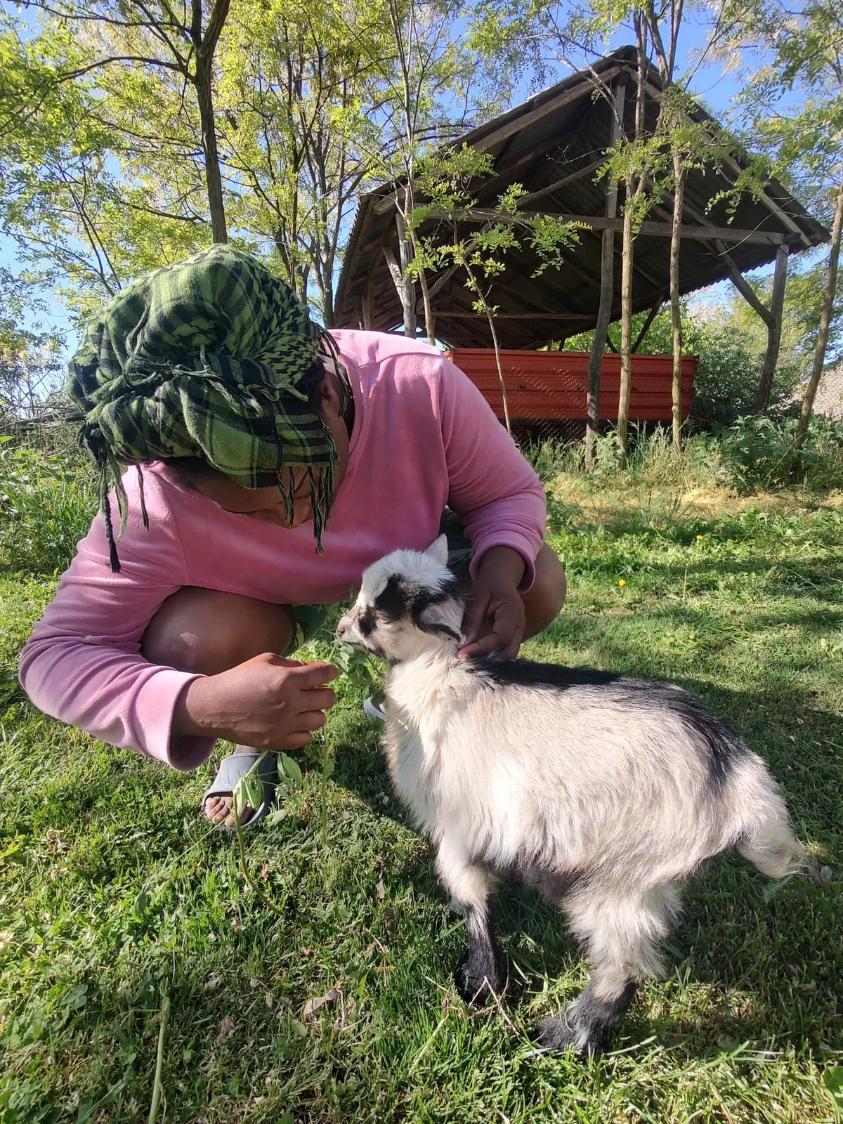
Family photographs give the identity its emotional center. The homepage arranges them like a personal scrapbook: warm paper frames, gentle rotations, small captions and a mix of village life, travel and family moments.
07 / Website design & digital experience
The brand,
given a digital home.
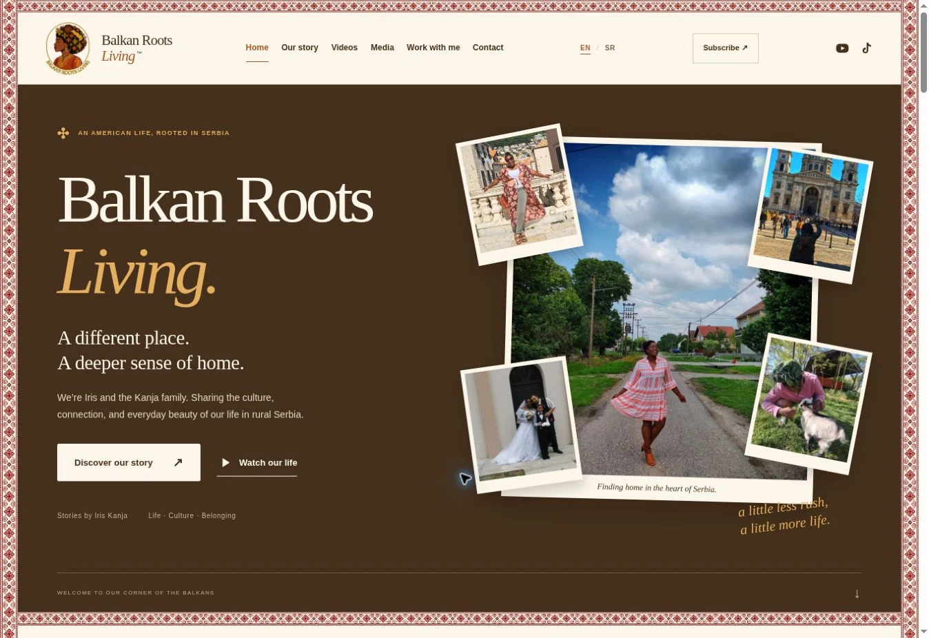
The website brings the complete identity into one responsive experience: a family introduction, a video library, original press links, collaboration information and contact. English and Serbian versions share the same visual system.
One story, two languages
English and Serbian Latin pages, a clear language switch and a consistent reading hierarchy throughout.
Stories in motion
A searchable YouTube collection, featured interviews and carousels for press coverage, each linked to its original source.
Made for every screen
Responsive layouts, compact mobile navigation, touch-friendly carousels and folk dividers that scale with the page.
The mobile experience
The same identity.
A more focused rhythm.
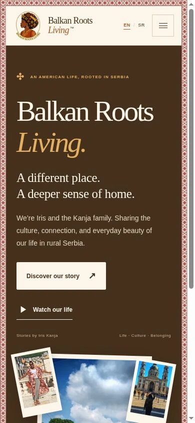
On smaller screens, the story moves into a single column. The header becomes compact, the folk borders become finer, and the primary action stays clear. The typography and warm palette keep the experience recognizably Balkan Roots Living.
A warm first impression
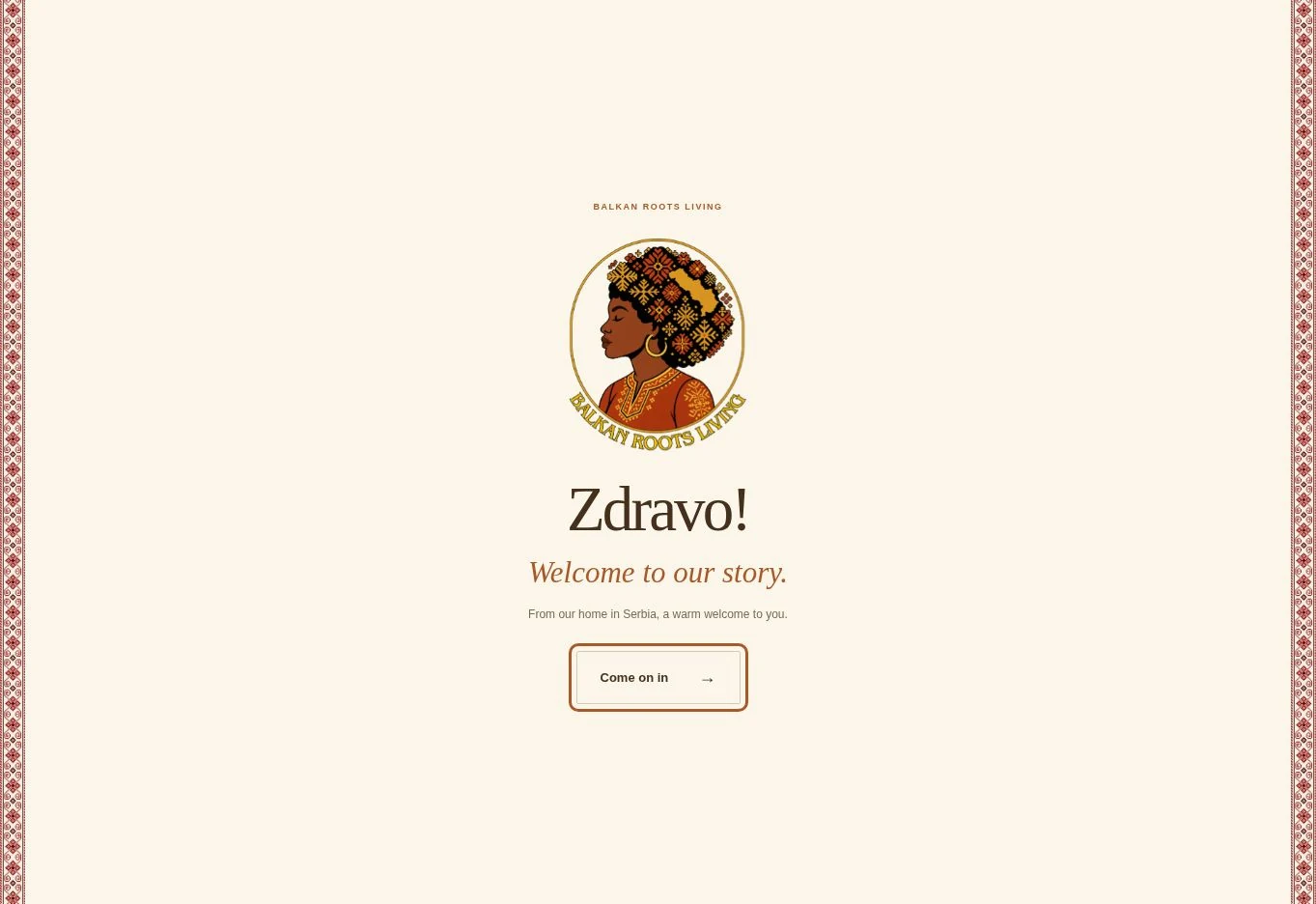
“Zdravo!” sets the tone.
The opening greeting introduces the emblem with a gentle animation. It stays until the visitor chooses to enter, and it can be replayed from the footer. The language and visual treatment match the rest of the site.
The newsletter signup records consent and subscriber details. The contact form opens a prepared email draft addressed to the family’s Gmail inbox.
08 / Brand applications
The same soul.
Across the story.
The logo, type and palette form a system that can travel beyond the website. These social and editorial compositions show how the identity stays recognizable in different formats.
A little less rush.A little more life.Balkan Roots Living / Iris Kanja
Finding home.Sharing the journey.@Balkanrootsliving / YouTube & TikTok
09 / The complete package
From the first impression
to the last detail.
A complete identity and website package for Iris: one visual language across the emblem, editorial system, page layouts and family storytelling. My work connected the brand decisions to their implementation in the live experience.
- 01
- Brand directionPositioning around family, belonging, cultural connection and life in rural Serbia.
- 02
- Logo developmentIllustrated emblem, Serbia silhouette in the hair and a transparent digital master.
- 03
- Color & typographyWarm digital palette, headline and body hierarchy, and guidance for readable combinations.
- 04
- Pattern & art directionSerbian embroidery applications, scrapbook framing and a family-led photographic approach.
- 05
- Website design & implementationResponsive page layouts, English and Serbian versions, navigation and content organization.
- 06
- Content & launchYouTube and media collections, newsletter signup, contact routes, welcome interaction and custom domain setup.
Continue exploring